User Experience (UX) And User Interface (UI) Design Are Crucial For Creating Compelling And Engaging Digital Products.
Implementing the best UX/UI design practices outlined in this article ensures that your designs are user-centered, intuitive, and visually appealing. This includes conducting user research to understand their needs, creating transparent navigation systems, designing responsively for different devices, using visual hierarchy to guide attention, maintaining consistency in visual elements, considering accessibility, conducting user testing, incorporating micro-interactions and emotional design, and embracing collaboration throughout the design process.
It’s also essential to avoid common pitfalls such as overwhelming complexity, inconsistent navigation, lack of feedback, poor performance, and ignoring user feedback. By following these practices and avoiding pitfalls, you can create UX/UI designs that delight users and drive the success of your digital products.


1. User and Market Research
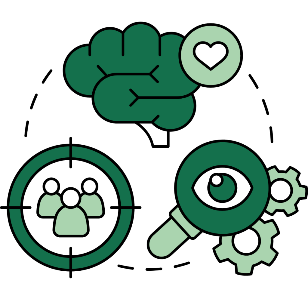
Start by embarking on a research project to uncover your target audience, their needs, and pain points. This will help you create designs that address their specific requirements.
In parallel, build a competitive matrix chart to uncover market pockets in which you can position your product. A competitive matrix chart is a visual tool used in UX/UI design to compare and analyze the strengths and weaknesses of different competitors in the market. It helps designers and product teams better understand their competitive landscape and identify opportunities for differentiation.
The matrix typically consists of different criteria or features along the horizontal axis and competing products or companies along the vertical axis. By evaluating and plotting each competitor’s performance against these criteria, teams can make informed decisions about their product’s positioning and identify areas where they can excel. This analysis is crucial for creating a user-centered product that stands out in the market.

2. Clear Navigation
Design and develop a clear and intuitive navigation system to help users quickly find what they want. Use consistent labelling and organization to enhance usability.
Start by mapping out the information architecture of your product and create a logical hierarchy of pages and sections. Use clear and descriptive labels for navigation elements and avoid jargon or ambiguous terminology. Implement a familiar navigation pattern for users and ensure consistency throughout the product.
Consider the below design tools to enhance the experience you are trying to build for the user:
Microinteractions
Implement micro-interactions to enhance the overall user experience. Microinteractions are small, subtle animations or feedback providing visual cues and delighting users. They can indicate a successful action, provide loading feedback, or add a touch of personality to your product. Consider incorporating micro-interactions for button clicks, form submissions, notifications, and other user interactions. However, it’s essential to use them judiciously and ensure they enhance usability rather than becoming distracting or overwhelming.
Emotional Design
Create designs that evoke positive emotions and establish a connection with users. Emotional design focuses on the aesthetic and experiential aspects of the product, aiming to create a memorable and enjoyable user experience. Consider using color psychology, typography, imagery, and other visual elements to evoke specific emotions that align with your brand and product objectives. Incorporate storytelling elements to engage users emotionally and create a sense of immersion. However, balance aesthetics and usability to ensure the design remains functional and user-friendly.

3. Responsive Design
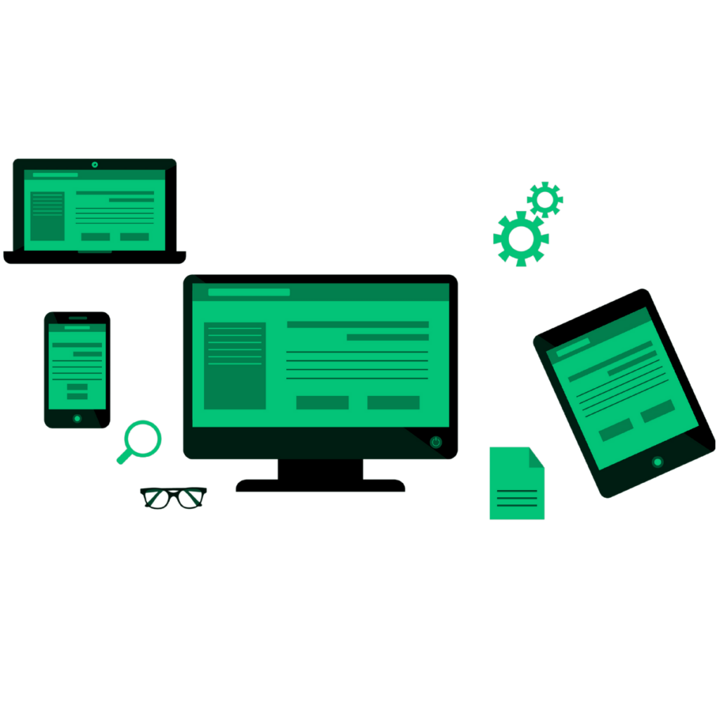
Ensure your designs are responsive and optimized for different devices and screen sizes. This will provide a seamless experience for users across various platforms. Start by designing for mobile devices first, as they have smaller screens and more limited functionality.
Use a mobile-first approach to prioritize content and features essential for users on the go. Test all design elements on various device models and screen sizes to ensure that they adapt and display correctly. A quick and easy way to test this is by using your website’s “Inspect” function. To access this, head to your browser, right-click on your website, select “Inspect,” and then press on the button with the mobile and laptop icon on the Developer Tools window shown. Go through all the size pairings or model simulations and consider touch interactions, screen resolutions, and device orientations as users reach the desired goals.

4. Visual Hierarchy
Use visual hierarchy to prioritize essential elements and guide users’ attention. Make sure that crucial information stands out and is easily digestible.
Start by understanding the content and functionality hierarchy of your product. Use contrasting colors, typography, and sizing to create visual distinctions between elements. Utilize whitespace effectively to create a balanced and organized layout. Apply the principles of Gestalt psychology, such as proximity, similarity, and closure, to build meaningful relationships between elements and aid in information processing.

5. Consistency
Maintain consistency in visual brand elements throughout your design, such as colors, typography, and icons. Consistency enhances usability and creates a cohesive user experience.
Start by establishing a design system or style guide that defines your product’s visual elements and guidelines. Use colors, typography, and iconography across all screens and interactions. Ensure the spacing, alignment, and proportions remain consistent throughout the product. Consistency improves usability, strengthens brand recognition, and establishes trust with users.

6. Accessibility
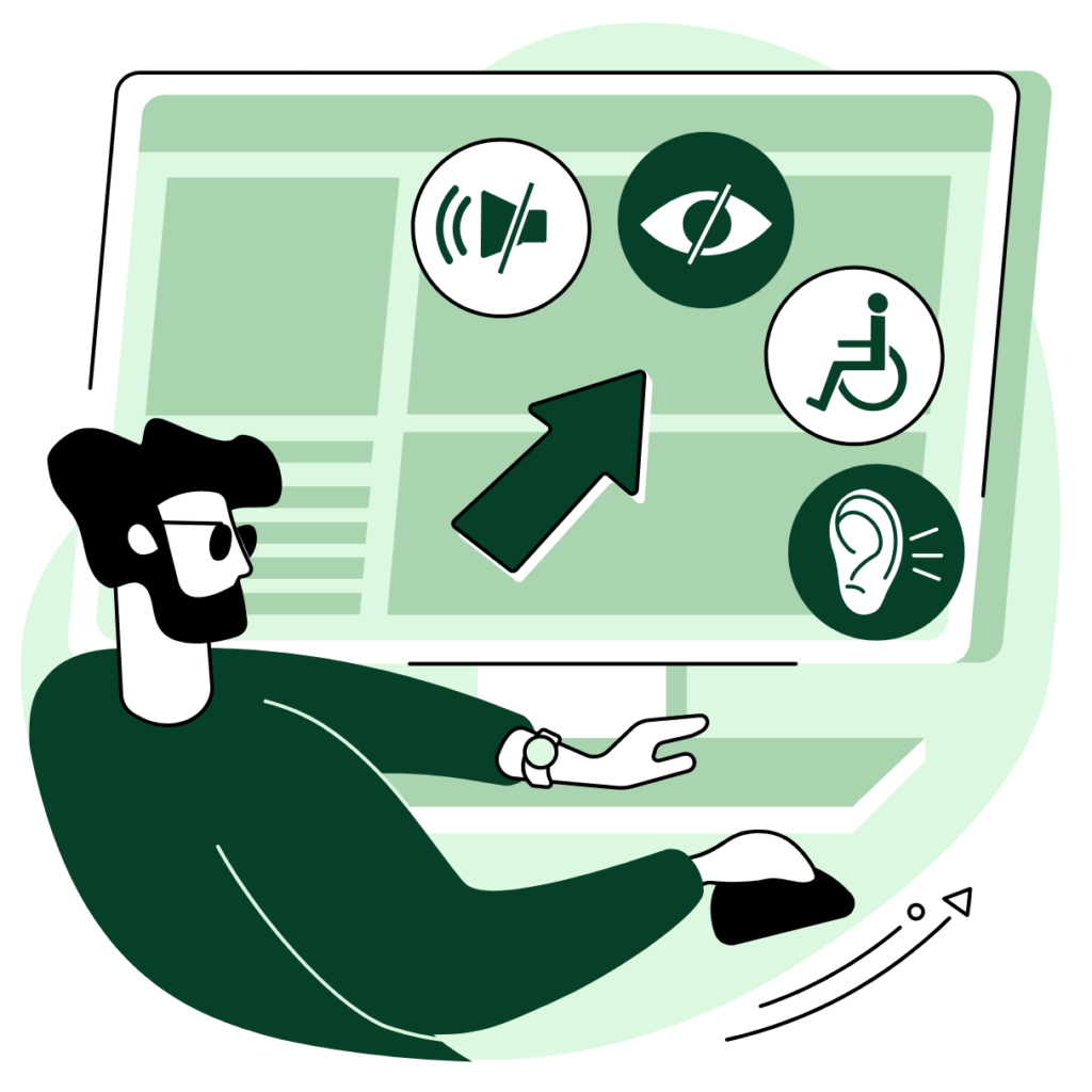
Depending on your audience, consider designing with accessibility in mind to ensure that your product is usable by people with disabilities. Consider factors such as contrast, text size, and screen reader compatibility.
Start by following accessibility standards and guidelines, such as the Web Content Accessibility Guidelines (WCAG). Use sufficient color contrast between layers, text, and background to improve legibility for visually impaired users. Provide options to adjust text size and font styles to accommodate low-vision users. Ensure that your product is compatible with screen readers and other assistive technologies. Finally, consider conducting usability testing with individuals with disabilities to identify and address accessibility barriers.

7. User Testing
Gathering insights and feedback to identify areas for improvement should be a staple mindset your team needs to inhibit. The data collected will help you validate your design decisions and make data-driven optimizations if done correctly.
Digital Behavioural Tools
Good data sampling in any research is collected through recurrent, non-invasive monitoring of the users’ experience. We recommend selecting and onboarding a website or app behavioral tool to facilitate this. Tools like Hotjar and FullStory provide valuable insights into how users interact with your digital assets. Using the screen recording features, these tools enable your team to track user behavior beyond static analytics, including mouse movements, clicks, and scrolling patterns. On the flip side, graphical analysis tools such as heatmaps can give you an aggregated view of how users interact with every piece of content, button, or page on a website and app. With such tools, you can also gather user feedback through surveys and polls triggered at various stages of their user journey.
By analyzing the data collected, you can identify areas of improvement, optimize the user experience, and increase conversions. These behavioral tools offer valuable information for UX/UI designers, allowing them to make data-driven decisions and create more user-centered designs.
Focus Groups
Another approach you can take is to recruit participants within your target audience and observe their interactions with your product. Start by defining clear test objectives and scenarios for your user tests. Collect qualitative and quantitative data through interviews, surveys, and task completion rates. Analyze the findings and identify usability issues or pain points. Use their feedback to iterate and refine your digital assets’ designs, ensuring that they meet the needs and expectations of your users.
Embrace a collaborative design approach involving stakeholders, team members, and users throughout the design process. Collaboration fosters creativity, innovation, and a sense of ownership among team members. It also ensures the design reflects different stakeholders’ diverse perspectives and needs. Encourage open communication, conduct design workshops, and solicit feedback and ideas from all team members. Incorporate user feedback in the design process through usability testing, co-creation, and feedback sessions. This collaborative approach will result in more informed and user-centric design decisions.

Overwhelming Complexity
Avoid overwhelming users with complex and cluttered designs. Keep your interface simple, clear, and focused on essential tasks to prevent confusion and frustration. Use progressive disclosure techniques to reveal information and functionality as users need it gradually. Shortlist the features based on user needs, prioritize content accordingly, and remove unnecessary or redundant elements. Conduct usability testing to identify areas of cognitive overload and streamline the user experience.

Inconsistent Navigation
Inconsistent navigation patterns can confuse users and make it difficult for them to navigate through your product. Ensure that navigation is consistent across all screens and interactions. Use standard navigation patterns and conventions that users are familiar with. Provide clear visual cues, such as active states and breadcrumbs, to indicate the user’s current location within the product. Avoid sudden changes in navigation structure or labeling that can disorient users. Conduct user testing to validate the effectiveness and clarity of your navigation system.

Lack of Feedback
Build a feedback loop for users when they interact with your product. Lack of feedback can leave users uncertain whether their actions were successful. Use visual cues like animations, tooltips, and progress indicators to provide immediate feedback for user actions. Display confirmation messages or error notifications to inform users about the outcome of their interactions. Ensure that feedback is clear, concise, and contextual to avoid ambiguity. Test your feedback mechanisms to ensure they are noticeable and informative to users.

Poor Performance
Slow loading times and unresponsive interactions can frustrate users. Optimize your designs for performance to provide a smooth and seamless experience.
PRO TIP: you can leverage Google Chrome’s Lighthouse feature in the Developer Tools window to generate an audit on your site that can pinpoint areas of improvement. To use the Lighthouse feature in Google Chrome, follow these steps:
- Go to the webpage that you want to analyze using Google Chrome web browser.
- Right-click anywhere on the page and select “Inspect” from the context menu. This will open the Chrome Developer Tools. In the Developer Tools window, click on the “Lighthouse” tab at the top.
- Click on the “Generate Report” button to start the analysis.
- Lighthouse will run a series of audits on the webpage, evaluating its performance, accessibility, best practices, SEO, and more.
- Once the analysis is complete, Lighthouse will generate a report with detailed results and recommendations.
- Review the report to identify areas where the webpage can be improved.
- Use the recommendations provided by Lighthouse to optimize the webpage and enhance its performance, accessibility, and overall user experience.
By using the Lighthouse feature in Google Chrome, you can gain valuable insights into the performance and quality of your web pages and make data-driven optimizations to create better user experiences.

Ignoring User Feedback
User feedback is invaluable for improving your UX/UI. Ignoring or dismissing user feedback can lead to missed opportunities for enhancing the user experience. Establish intuitive channels for users to provide feedback, such as feedback forms, customer support, or user research sessions. Actively listen to user feedback, analyze patterns and trends, and prioritize the most relevant and impactful suggestions.
Communicate with users to acknowledge their input and provide updates on the changes implemented. Continuously iterate and improve your deployed designs based on user feedback to create a user-centric product.
Conclusion
Following the best practices and avoiding common pitfalls outlined in this article, you can create UX/UI designs that efficiently drive engaged users to the desired business goals.
Do want to explore this topic further? At VANE IVY, we use our extensive background in data and marketing to help you and your team to expedite your process. Give us a shout!


